
PROJECT LOCAL
-
Create a mobile app and responsive website to help youths sign up for local community service projects.
-
Chief UX designer, lead interaction designer, head researcher
-
1 week, February 2022
Project Overview
Project Vision
People imagine community service as unapproachable - projects are either hard to find, or take all day. There isn’t an easy way to sign up to do good in your community without giving up your time researching or scheduling.
But all that changes with Project Local. Now you can narrow down your community service projects based on dates, times, and even your interests! You can invite friends, add reminders to your calendar, and get in touch with the Project Coordinators all with one tap or click.
Challenges
Create 3 different wireframes, mockups, and prototypes for different screen sizes of a user experience journey
Balance clean design, large amounts of information, and scheduling processes in an engaging way
Meet our users
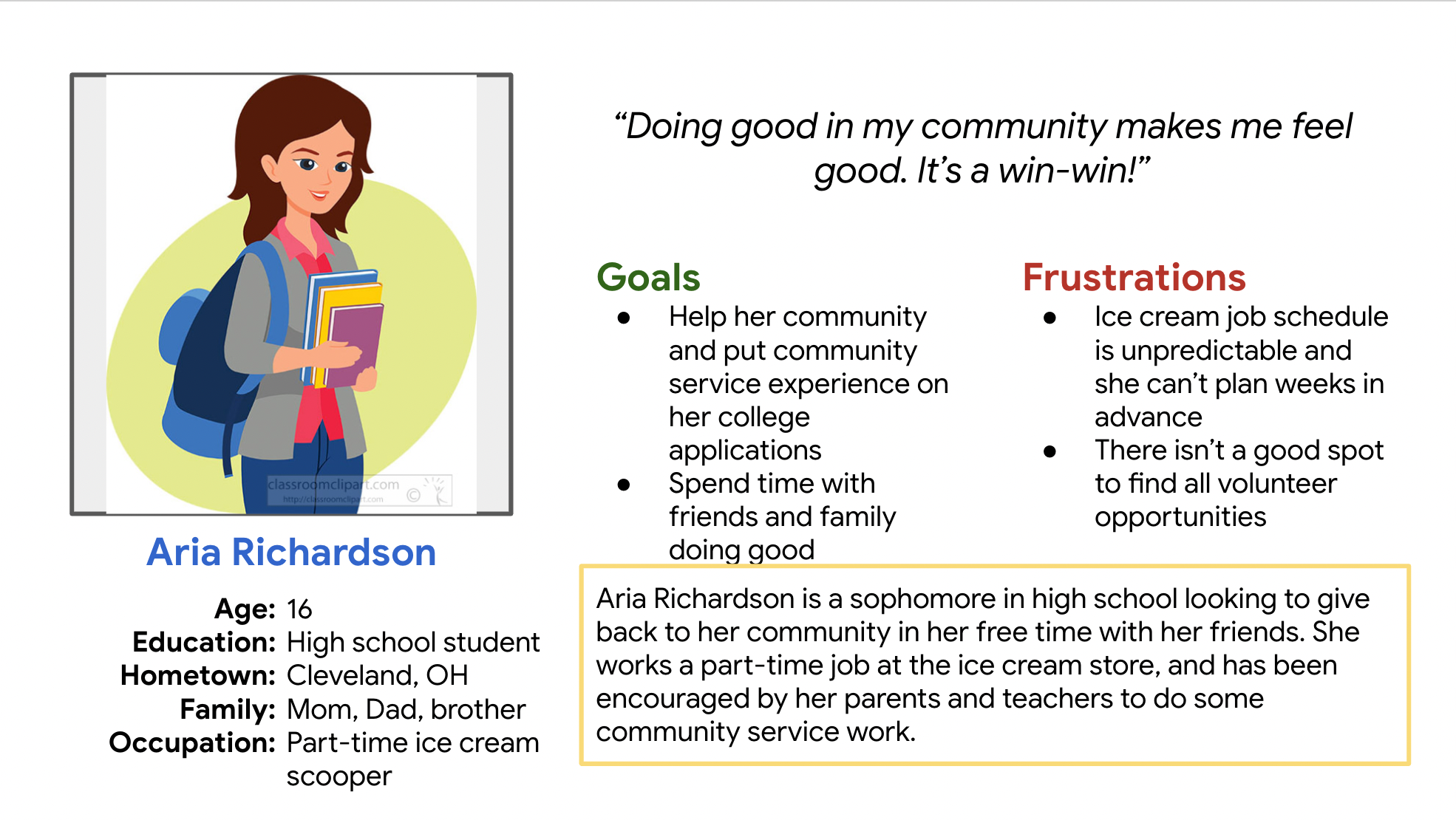
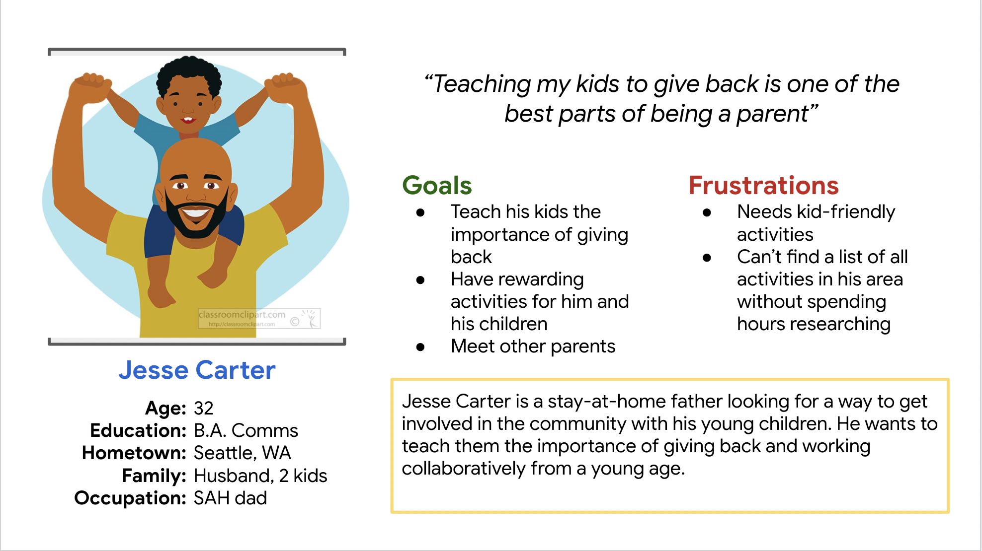
Research Summary
We conducted foundational research and design research. In the foundational research we found that users had a need to find all community service projects in one place. They wanted an app or website to be engaging and span across a variety of projects.
The design research really helped solidify the design of the app and website. We had to include more pages than we anticipated, but post-research has shown that it’s to the users benefit. They wanted detail, and they got it!

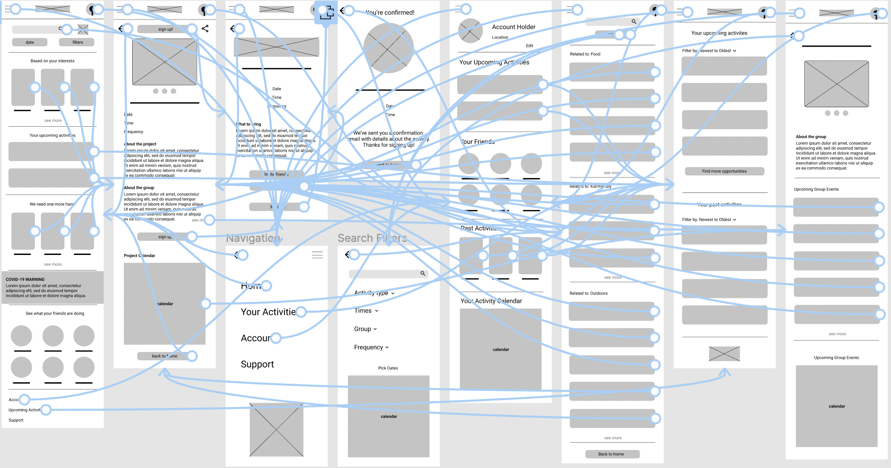
Step 1 - Paper wireframes
Drawing out the ideas, both out of my brain and on paper has become a favorite way to brainstorm. I usually go into a project with a solution in mind, so being able to get it out of my head and make room for new ideas is a crucial step of my process.
Usability Study Parameters
-
Moderated usability study
-
Remote, United States and United Kingdom
-
5 participants, three female, 2 male
-
10-20 minutes
Usability Study Findings
1 - Navigation
Not all the back buttons worked, needed to finalize prototyping before moving onto the mockups.
2 - Copy
The language of the buttons “sign up” was confusing when repeated on two different pages
3 - Design
The search bar looked more like a button than a bar which hindered the users searching experience.
Mockups

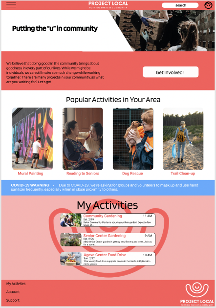

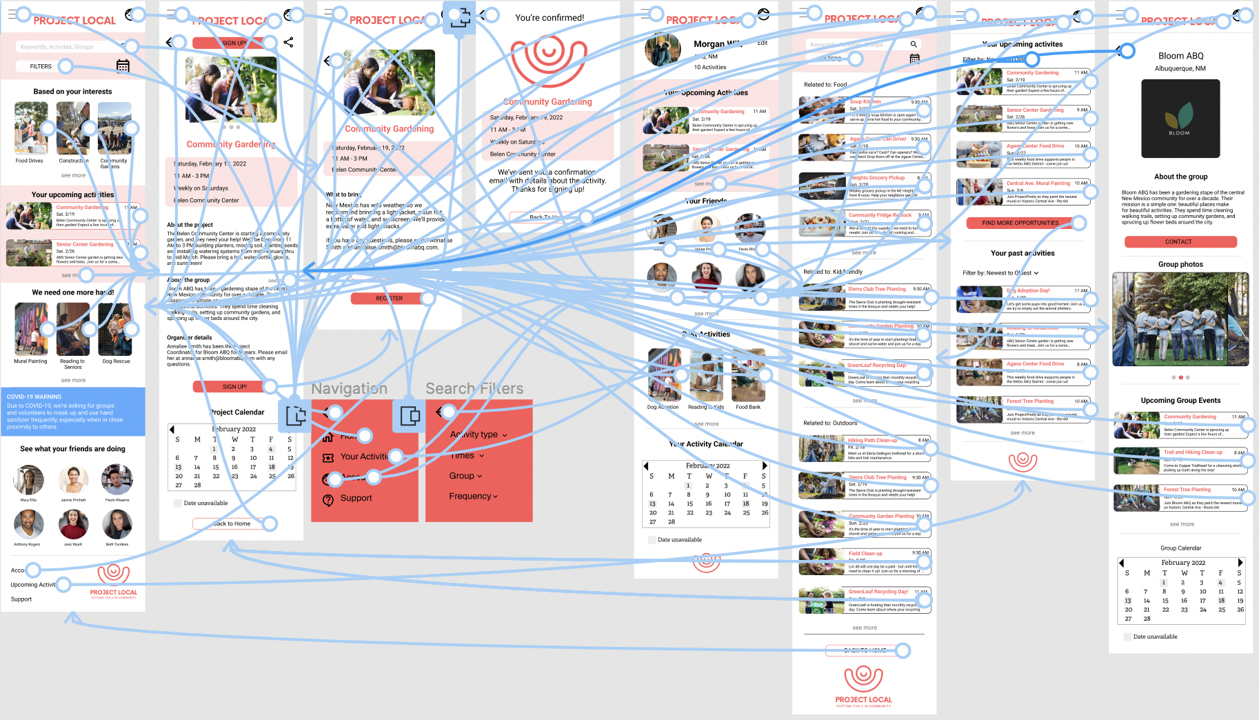
Accessibility Considerations
1
We made sure to use colors with high contrast so readability was easier for users with limited eyesight.
2
Font sizes were appropriately sized for the different screen sizes to also aid users with limited eyesight.
3
A clean, simple design across the various screens helps users with limited digital literacy understand what they need to do in order to sign up for projects.
Conclusion
I learned that I still had a preference for making mobile apps over websites, and that if I want to expand my comfort zone I need to work a little harder on the websites. I have other projects I’m working on that I might see if I could transition them into websites and get more practice.
Participant B noted “this app was super easy to use. It definitely has some potential here, and I hope to see it made into a real app soon.”
In terms of next steps, I’m planning on making paper wireframes of the tablet and website designs, starting from the beginning and seeing if I can improve. I feel like my work was rushed because of personal deadlines, and I didn’t do the work that I know I’m capable of. Confidence is a HUGE part of the UX game and something that I need to work on when designing for things outside my comfort zone.