

Mobile orders aren’t just for the birds anymore. Break an Egg is your new favorite brunch spot, with mobile ordering and customer loyalty to boot.
-
Break an Egg customer loyalty & mobile rewards app
-
Team lead, chief UX designer
-
3 weeks (Dec 2021- Jan 2022)
Project Vision
The Break an Egg app might not be groundbreaking in its mere existence, but that’s okay. We’re here to shatter some eggs, not society as we know it. This app is a community-maker, a friendship-builder, and a tummy-satisfier - basically all the good stuff.
Challenges
Create a minimalistic UI while keeping users as the focus
Design an intuitive and friendly user interface
Understanding the user
Initial research showed the users weren’t interested in downloading an app that only offered rewards. We needed to sweeten the pot for our future users to want to use the app.
Our personas varied between a college student looking for discounts on local, healthy meals, to working moms wanting a quick, reliable way to get healthy food on the go.
While nothing we created during these first steps looks anything close to the final product, they did set us down a helpful path.
Research - foundation & design
Our foundational research phase was a participant study of 4 individuals, aged 20-35, employed, and living in metropolitan areas across the US and UK. We wanted to know what they thought about loyalty apps, if they subscribed to any, and what would make them download one.
The questions we asked:
Do you currently have any loyalty programs? If yes, which? If not, why not?
What are some pros of loyalty apps or programs?
What are some cons of loyalty apps or programs?
What would make you want to download a loyalty app?
What sort of rewards would keep you coming back to a particular app?
______________________________________________________________________
Our personas varied between a college student looking for discounts on local, healthy meals, to working moms wanting a quick, reliable way to get healthy food on the go.
______________________________________________________________________
While nothing we created during these first steps looks anything close to the final product, they did set us down a helpful path.
Our users didn’t want a loyalty app. We needed to change tactics.
Our pain points
Pain Point 1
Users were hesitant to download loyalty apps unless the deals were really incredible, or the entire process was convenient. The users we surveyed wanted a loyalty system where they didn’t have to do any of the work.
Pain Point 2
Users only wanted loyalty apps if they got rewards at a high rate. They weren’t interested in “every 10th visit you get a free small thing.” They wanted big rewards and often.
Pain Point 3
Users weren’t likely to download an app if it was strictly loyalty based. Rewards on their own aren’t enough for the surveyed users to want to make that download choice.
The User Journey

What the user journey looked like at the beginning of this project.

The user journey we ended up with.

Wireframes - Paper
We sketched out a few different designs for the Break an Egg homepage, and eventually combined aspects of each into the final product.
We wanted to highlight the rewards and the menu options equally, so users would be interested in both.
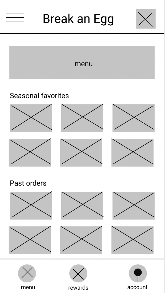
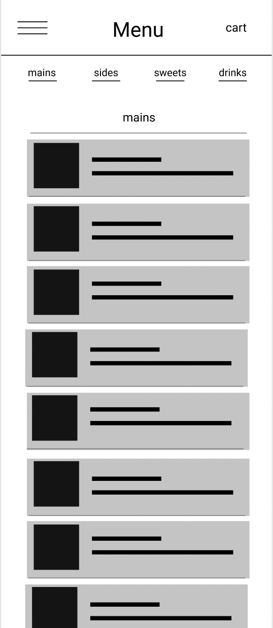
Wireframes - Digital
Time to take the paper wireframes and move them into the digital sphere. After consolidating our favorite ideas for the homepage, we put it all together in Figma, and came up with something that looked like this.


Lo-fi prototype
Version 1
Little bit of research later, and we ended up here. At our high fidelity prototype.

Hi-fi,
High-five
After three rounds of research and multiple late nights, we finally pulled together all the notes, ideas, and feedback and turned it into this high-fidelity prototype. This is now ready to hand off to our Engineering team (if we had one)!

Brand Guidelines
We made sure to stick with Break an Egg’s brand guidelines, and play with all the colors and fonts available in their palette. We wanted the vibe to be friendly, fun, and approachable.
Conclusion
I’m really proud. Not to toot my own horn (who am I kidding, this is MY portfolio), but for my first UX design project, I’m really, really proud. From the things I learned and accomplished, to the challenges I overcame (especially when the user research went entirely different from the way I planned), this app was my stepping stone into this field.
I already know there are things I want to tweak and fix as I’m a perfectionist (and also have a hard time calling something complete). In terms of next steps I’m hoping that I can make the changes I really want to see, and then be proud enough of my work to let it be. She’s tired. Heck, I’m tired. But the tired is so, so, good.